Designing for everyone: Notes on inclusion, accessibility and curiosity
- Natalie Davis

- Jul 14, 2025
- 4 min read
A few weeks ago, I spent a day soaking up ideas at the Design Outlook Accessibility and Inclusion conference in Melbourne. As someone who’s always been driven by making digital things feel right, intuitive, useful, and delightful, I’ve been leaning deeper into what it means to also make those experiences accessible. Like, actually accessible. Not just tick-the-box accessible.
The day opened with a story that stuck. Bruce Lindsay Maguire, who is blind, took legal action against the Sydney 2000 Olympics because he couldn’t buy tickets from their website. He couldn’t use the website to do something so simple, so every day, because no one had thought to design it with him in mind. That was over 20 years ago, and while we’ve come a long way, there’s still a quiet urgency in the work we do now. To do better, and to do it on purpose.
The speakers on the day weren’t just impressive. They were honest and deeply informed by lived experience. One of the strongest messages of the day was not to get overwhelmed by the WCAG checklists, it was to start where you are. Some changes are better than no changes. Stay curious. Keep going. I tend to be that annoying person who asks the "but why?" and "do we really need that?" kind of questions, but I’ve learnt that those questions often open up space for better, more thoughtful design.

What does accessibility actually mean?
We throw around words like “inclusive” and “human-centred” a lot, but what does it really mean to design for everyone?
It means thinking about the one in five Australians who live with disability. It means recognising that accessibility isn’t niche. It’s normal. It’s also situational. A broken wrist. Eye strain. ADHD. Accessibility is about designing experiences that still work, no matter the context.
A standout moment came from Sunflower AI, who supported the day with their live, auto-generated captions, a brilliant solution not just for people who are deaf or hard of hearing, but also for people like me who like to read and listen at the same time. They also shared some practical tips on choosing typefaces that support readability online. Their top pick? AR One Sans. It’s an accessibility-friendly font designed with open letterforms, generous spacing, and distinct characters that make reading easier for everyone, including people with visual or cognitive impairments.

Andrea Boundy from Telstra shared how their team has embedded accessibility into every part of the design process. They’ve got 16 customer experience principles, and every single one of them is checked against WCAG standards. It’s not a side project or a compliance tick. It’s part of their DNA. They’re working as an organisation to provide the right training to their teams internally and create a culture of feedback to guide and support their people.
They’ve implemented consideration from homepage video banners, allowing users to control if these are played or not – as motion can make some feel unwell, to variations on temporary app games allowing everyone to be able to enjoy every feature. Let’s aim for this level of dedication to providing digital products for everyone.

Designing for difference: neurodiversity at work
One of the most interesting sessions of the day explored the power of neurodiversity in teams. Cognitive diversity isn’t just a feel-good HR policy. It’s a competitive advantage.
“Recognising and embracing such individuals not only supports inclusion, but offers organisations a powerful path to unlocking productivity, innovation, and resilience.” - Forbes
Kobi Jae Masterson reminded us of what’s often missed when organisations don’t create space for neurodivergent minds: deep focus, unusual problem-solving, attention to detail, and loyalty. When we design with neurodiverse people in mind not just for digital experiences, but for the way we hire, run meetings, and build culture we make space for better thinking.

So, where can you start?
Whether you are designing an end-to-end web experience or managing how your brand is showing up on the digital shelf there are several starting points if your organisation isn’t considering accessibility as part of the design phase.
Here’s a few items to check on your website or online store.
Colour contrast checker – Check your brand colours and how to use them currently online.
Font styles can be tricky to read – Here’s a guide on how to choose the best fonts for your project.
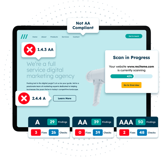
Web accessibility checker – WCAG compliance checker identifies web accessibility issues and gives exact instructions for fixing them
The day left my brain buzzing in the best way. It was thoughtful, surprising, and packed with the kind of ideas that quietly shift how you see things. There was no ego, just generous people sharing what they know and why it matters. I walked away with a notebook full of scribbles, a head full of questions, and a reminder that inclusive design isn’t extra - it’s just good design. It’s not the shiny stuff that sticks, it’s the stuff that makes things work for more people.
Arktic Fox partners with ambitious businesses to design digital solutions that drive growth, retention and standout user experiences. Whether you're refining your digital shelf, levelling up your content strategy or embedding accessibility into your approach, we can help you build a winning digital strategy in today’s fast-moving landscape. Find out how we can help.